We all know that first impressions matter, and in the digital realm, an eye-catching template can make all the difference.
Fortunately, Webflow is a great platform that allows even more proficient users to achieve greatness with their websites.
That’s why our goal here is to equip you with valuable design tips and tricks, empowering you to create awe-inspiring Webflow templates that leave a lasting impact.
So, without further ado, keep reading to learn valuable design tips and tricks to help you create an amazing website.
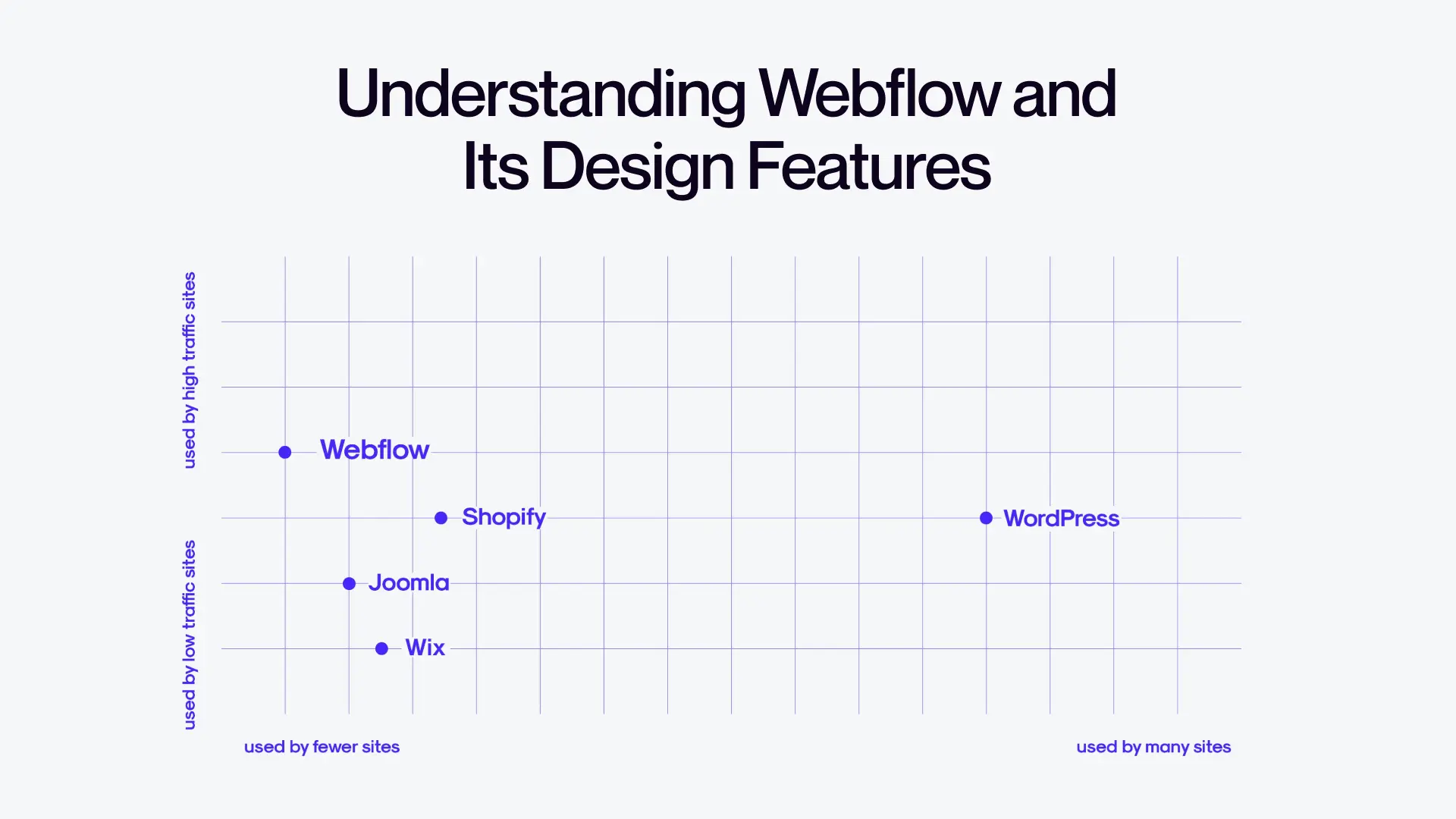
Understanding Webflow and Its Design Features

Let's take a closer look at Webflow and its significance in the world of web design.
Webflow is an incredible tool that empowers designers to bring their creative visions to life without the need for complex coding.
It's like having a magic wand that allows you to design and develop websites with ease, a wand powered by clean no-code.
With Webflow, you gain access to a wide array of flexible design options and customization features.
It's a playground for creativity, offering you the freedom to customize every aspect of your website.
Whether it's tweaking the layout, experimenting with fonts and colors, or adding interactive elements, Webflow provides a user-friendly interface that puts you in full control.
Gone are the days of being limited by the constraints of templates or relying on pre-built designs.
Webflow allows you to unleash your creativity and create unique, tailor-made websites that perfectly align with your vision.
Webflow Templates Design Tips and Tricks

It’s time to walk you through all the tips and tricks that you can use to create stunning template designs through Webflow.
Do the research
Before diving into the design process, it's crucial to emphasize the importance of thorough research.
Taking the time to understand the needs and preferences of your target audience can make all the difference in creating a successful template.
By conducting research, you gain valuable insights into what appeals to your target audience.
You can explore websites in similar industries, analyze design trends, and identify what sets your audience's hearts racing.
This knowledge serves as a compass, guiding you toward creating a template that resonates with your intended users.
Brainstorming and planning are essential steps in bringing your design concept to life.
It's like sketching a blueprint before building a masterpiece.
Take the time to brainstorm ideas, explore different layouts, and experiment with various design elements.
Let your creativity flow, and don't be afraid to think outside the box.
Consider the overall purpose and message of your template.
Is it meant to showcase a portfolio? Sell products? Provide information?
Understanding the purpose helps shape the design concept and ensures that every element aligns with your goals.
Remember, the success of your template lies in its ability to engage and captivate your audience.
So, invest time in research, understand your target audience, and let your imagination soar during the planning phase.
These crucial steps lay the foundation for creating a template that not only looks stunning but also resonates with your intended users.
Take a look at what others are doing
When it comes to seeking inspiration, one approach is to explore real-world examples of websites in the specific category you are designing for.
It's somewhat similar to searching for ideas, but in this stage, focus on finding actual websites that align with the project.
This process resembles the way one seeks inspiration for building client sites.
However, in this case, do not only look for design styles but also pay attention to the specific pages that need to be included in the website.
For instance, restaurant websites have a distinctive aesthetic, and they typically feature pages like menus and reservation booking options, which might be uncommon in other types of websites.
During this inspirational journey, explore platforms such as Dribbble and Behance.
You can find inspiration there but never ever copy someone else’s work.
Stunning layouts
When it comes to designing a visually appealing template, certain key elements play a crucial role.
Let's delve into these elements and discover how to create a well-structured and balanced design that catches the eye.
First and foremost, a visually appealing layout is characterized by its harmonious arrangement of elements.
It's essential to strike a balance between different components, such as text, images, and interactive elements.
By carefully considering the placement and size of these elements, you can guide the viewer's attention and create a seamless visual flow.
One effective technique in achieving a captivating layout is by utilizing whitespace strategically.
Whitespace refers to the empty or blank spaces between elements. It might seem counterintuitive, but whitespace is a powerful design tool.
By incorporating ample whitespace, you give your design room to breathe, allowing important elements to stand out.
It creates a sense of elegance and clarity, enhancing the overall visual impact.
To effectively use whitespace, consider the spacing between paragraphs, images, and other design elements.
Aim for a balanced distribution that complements the content and provides a comfortable reading or viewing experience.
Don't be afraid to experiment with different amounts of whitespace to find the perfect balance that aligns with your design goals.
Prioritize responsiveness
In today's web landscape, responsive design has become paramount.
It's crucial to ensure that your template looks fantastic and functions flawlessly across various screen sizes and devices.
First and foremost, responsive design ensures that your template adapts seamlessly to different screen sizes, from large desktop monitors to small mobile devices.
To accomplish this, consider utilizing responsive frameworks or CSS media queries that adjust the layout and content based on the screen dimensions.
Test your template thoroughly on different devices to ensure a consistent and enjoyable user experience for all.
In addition to responsiveness, optimizing loading times is equally important.
Visitors expect a fast and efficient browsing experience, regardless of the device they're using.
To enhance loading times, optimize images by compressing them without compromising their quality.
Minify your CSS and JavaScript files, reducing their file sizes.
Utilize caching techniques to store commonly accessed resources, reducing the need for repeated downloads.
By implementing these optimizations, you can provide users with a smooth and snappy browsing experience.
Remember, in the modern web landscape, responsiveness and mobile-friendliness are essential.
Do not be afraid to show off!
Creating remarkable templates is just the first step.
To maximize their impact, it's crucial to present them effectively to potential users and reach a wider audience.
Firstly, know that presentation matters.
Design visually appealing template previews and demos that capture the essence of your design.
Use high-quality images, engaging content, and interactive elements to demonstrate the full potential of your template.
A well-crafted preview can ignite curiosity and entice users to explore further.
Consider creating a dedicated website or landing page to showcase your templates.
Provide comprehensive information, including features, customization options, and pricing details.
Make it easy for potential users to visualize how your template can meet their specific needs.
In addition to presentation, marketing plays a crucial role in reaching a wider audience.
Leverage social media platforms, industry forums, and design communities to promote your templates.
Engage with potential users, answer their questions, and provide valuable insights.
Collaborate with influencers or bloggers in the web design niche to gain exposure.
By implementing an effective marketing strategy, you can increase visibility and attract more users to your templates.
Final Thoughts
Now armed with the design tips and tricks shared in this blog post, it's time to unleash your creativity and create stunning Webflow templates that leave a lasting impression.
Embrace the art of design, experiment with different elements, and always keep the user experience at the forefront.


